







 Tally Services
 Tally Customization
 Tally Implementation
 Tally Integration
 Tally Manpower Solutions
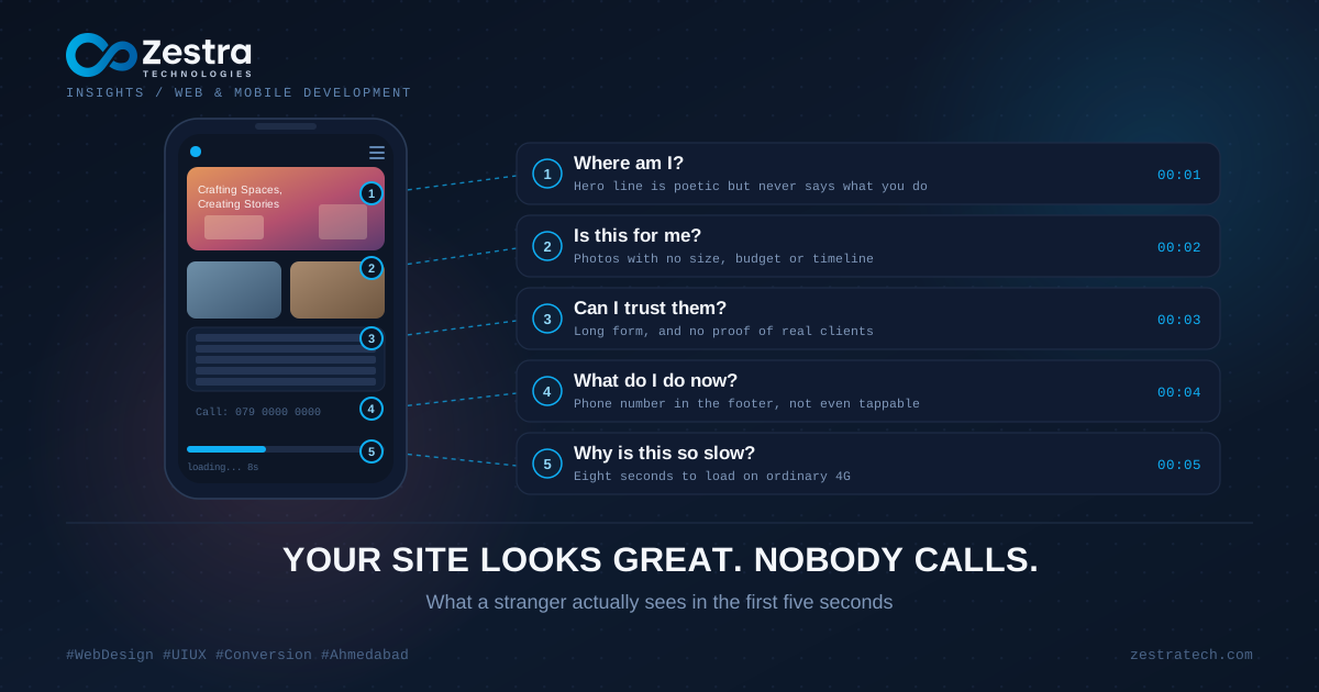
An interior design studio in Ahmedabad showed us their website with obvious pride. Full-screen photographs of finished apartments, soft transitions, a slow fade between slides. Friends had called it stunning. In three months it had brought them two enquiries, and one of those was a vendor trying to sell them tiles.
The owner's first guess was that they needed more traffic. It was a reasonable guess. It was also wrong, and the quickest way to see why is to stop looking at the site as the person who paid for it and look at it the way a stranger does.
Second One: Where Am I?
A homeowner searching for someone to design their flat clicks a result and lands on the studio's homepage. A photograph fills the screen. Over it, in thin white letters, sits the line "Crafting Spaces, Creating Stories."
It's a lovely line. It also tells the visitor nothing. Do they design homes or offices? Do they work in Ahmedabad or across India? Are they a luxury studio or a mid-budget one? The visitor has to go and find that out, and most people will not go and find it out. They will go back to the search results, where the next studio opened with "Interior design for 2 and 3 BHK homes in Ahmedabad." Less poetic. Far clearer.
A good homepage answers three things almost immediately: what you do, who it's for, and where. It can still be beautiful while doing so.
Second Two: Is This For Someone Like Me?
The visitor scrolls. More photographs, each one stunning, none of them labelled. Is that a 1,200 sq ft apartment or a 6,000 sq ft bungalow? What did it cost? How long did it take?
People judge fit through details. A single caption such as "3 BHK in Bopal, finished in 11 weeks" does more work than a dozen unlabelled images, because the visitor can compare it with their own situation. Without that, they cannot tell whether you are in their league or out of it, and uncertainty usually ends in a closed tab.
Second Three: What Do I Do Now?
Suppose the visitor is interested anyway. They look for a way to get in touch. The menu has nine items. "Contact" is the ninth, and on a phone the menu is hidden behind an icon. The phone number sits in the footer, as plain text. Tapping it does nothing, so they would have to memorise it, switch apps, and type it out.
This is the most common leak we see, and the most fixable. On mobile, which is where most of your visitors are, a phone number should be tappable and a WhatsApp button should be reachable without scrolling. Every extra step between interest and action loses a share of people, and the loss compounds.
Second Four: Can I Trust These People?
Some visitors push on, and they hit the enquiry form. Nine fields, three of them mandatory and unexplained, one asking for budget before the person has even spoken to anyone. Next to it, no reviews, no client names, no sign that a real human runs this business.
A form should ask for the minimum needed to start a conversation, usually a name and a number. Trust signals matter just as much: a few real client comments, a Google rating, a photo of the team, the area you work in. A beautiful site with no evidence of real customers feels like a brochure, and people hesitate to hand their number to a brochure.
Second Five: Why Is This Taking So Long?
All of this assumed the page loaded quickly. On a mid-range phone with ordinary 4G, those full-screen photographs, each several megabytes, took nearly eight seconds to appear. Many visitors left before second one even happened. Analytics showed it clearly: a large share of mobile visits ended without a single scroll.
The studio's photographs were the best thing about the business, and they were also what was hiding it.
What Changed for the Studio
Nothing was thrown away. The hero text now says what they do and where. Every project photo has a one-line caption with size, area and timeline. The images were compressed and lazy-loaded, so the page opens fast even on a weak connection. A WhatsApp button follows the visitor down the page, the form shrank to two fields, and six genuine client comments went up near the top.
The design looked about 90 percent the same. Enquiries went from two in three months to roughly that many per week. The difference sat entirely in how the site treated a stranger in their first few seconds.
A Quick Test You Can Do Today
Show your homepage to someone who has never seen your business. Give them five seconds, then take the screen away and ask three questions. What does this company do? Who is it for? What would you do next? If they hesitate on any of them, a visitor will too.
If you would like a proper outside view of how your site performs for a first-time visitor, our UI/UX design team does this kind of walkthrough, and you can get in touch to book one. Often the fixes are small, and they pay back faster than another round of advertising.